Here’s something I see get the best of many developers, from ones fresh off the boat to ones with years of experience.
The html/css “box model.”
Every element on a page can be considered a box.
Every box wraps around its html elements.
Every box can have: margins, borders, and padding. Here’s a handy image that illustrates this;
Taken from the w3cschools;
- Margin – Clears an area around the border. The margin does not have a background color, it is completely transparent
- Border – A border that goes around the padding and content. The border is inherited from the color property of the box
- Padding – Clears an area around the content. The padding is affected by the background color of the box
- Content – The content of the box, where text and images appear
It’s all easy enough to follow, so why do so many have a hard time with it? Well, here’s the key point;
When you set a dimension on the box, either width or height, you are setting the dimension of the content area.
Example: If you make a box 100px in width, then add 20px of horizontal padding, your box is now 140px, regardless of what you set as a fixed width.
It also doesn’t help that many of the most popular browsers have different interpretations of the box model. IE (Internet Explorer) is by the book, the examples and explanations above are exactly what IE will do. I know it is given heavy flack most of the time, but in truth, IE is ‘technically’ right. The Microsoft browser performs word for word how it was laid out by the web consortium. Other browsers differ in their own ways. You could assign the 20px horizontal padding to a box and in Firefox, it might subtract the space from the content area, thus keeping your box dimensions at 100px, but reducing your content area to 60px. There’s quirks to it all, like if you have a box at 300px width, and add a 4px border, you now have a box that takes up 308px space.
So how do we ‘beat the box model’?
It’s a pretty simple set of ‘tricks’. I had them pounded into my head a long time ago, but it’s something every developer should also have pounded in. Bluntly, until it’s in there for good;
- Enter the ‘inner’ div.
– Any box with a set dimension (this means pretty much all of them) should have an ‘inner’ div. The inner div is created so we can set a dimension on the parent element, and have our margins, padding etc. on a box with no dimensions. Again, the most important thing to understand, is don’t add margin or padding (especially padding) to a box with a set dimension. This is how we work around that, and get all browsers to play nice at the same time.
By encapsulating our paddings, margins, etc, in a box with no dimensions, they are forced to subtract space from the ‘content area’.
- Padding is vertical. Margin is horizontal.
– Padding still doesn’t like to play nice all the time. Especially horizontally. Margin has trouble with its top value. There’s a lot of issues, but I’m not going to attempt to cover them, just how to avoid them all in one fell swoop; Padding is vertical, margin is horizontal.
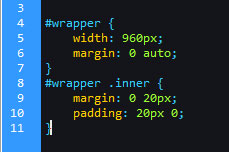
Example css:
Building like this will ensure that all browsers behave the same. It really changed my work life learning this.
The wrapper div will remain 960px, we don’t need to set a height so the page can grow and will pad the content, we have a nice ‘gutter’ from the margin so we can style elements however we need, etc. Every page element built in this method is simple to style, and will save you in browser hacks, fixes, etc. in the end. You almost don’t even need to cross browser check, as it’s near fool-proof.
Final tip:
Try to always build in a way that never needs margin or padding on a parent element. The only one I personally accept is margin-bottom as it’s unavoidable. Margin bottom will never break, so it’s safe, but it absolutely will if you use margin top or any padding styles. The less you use, the better.
Hope it helps.


