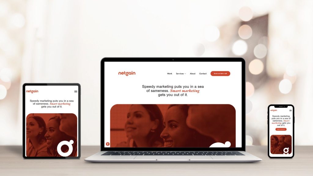
With mobile web browsing on the rise, it’s more important than ever to have a well-designed functional responsive website. It has been said that by 2015 mobile internet browsing will surpass its older desktop brother. It seems weird but it makes a ton of sense if you think about it. We carry our mobile phones on us everywhere. Even when we are at home, sometimes sitting on the couch is a heck of a lot comfier than sitting at a desk in a computer chair. Phones are evolving and can do pretty much everything a desktop can do on the web. In some cases some functions are just as easy if not easier to do on your phone than a desktop. Mobile Apps and webpages are usually simplified to what you are intended to use the site for. (This is about the place in my blog where you realize what I’m getting at.)
Why Design For Mobile?
Keep It Simple Stupid. K.I.S.S. One of my personal favourite design mantras/acronyms. The easier it is and faster it is for your viewer to find what they are searching for the better. We’ve reached a point in society where waiting isn’t cool. Ain’t nobody got time for that! You’d like to sit your viewer down firmly and remind them that patience is a virtue, but you can’t and it won’t do any good. If your site takes too long to load, or you can’t find the information you’re looking for you will leave. So it’s good practise to position things like the phone number of your business or links for your contact info within reach.
Don’t Forget About Tablets!
Tablet use is also on the rise and mobile specific sites are starting to kick the bucket. It’s all about the Responsive. If you don’t respond, it must mean you have died. At least that’s what you would think if someone jumped off the cliff into the dark waters of the internet beneath and didn’t reply to you after you shouted their name several times. So get on those media queries folks. Mobile-first is a saying going around and I’m not saying that’s the wrong way to go about things (clearly since I’ve told you how much mobile is on the rise) however I do believe in designing with Mobile-in-mind. If you know how elements will break down when going from device to device you can design your desktop elements accordingly. With phone resolution and screen size increasing it’s getting even easier. (FACT: The iPhone, one of the most advanced mobile devices now has one of the smallest screen sizes. I have one and I’m starting to get phone envy of the people with super large screens. We have come up with a saying at the office of “if it fits on the iPhone it’ll fit on pretty much everything else!”)
Useless story aside, I’ll end things here with important things to remember when designing for mobile:
-Some people have fat fingers, so design your buttons BIG!
-Some elements on your desktop may not be necessary on mobile *cough cough* pretty sliders that do nothing *cough* so get rid of them for mobile!
-If you are a business, please, please put your location somewhere easy to find and hours of operation!
-A slide out menu or drop down menu can clean up your mobile site. (K.I.S.S!)
-MOST IMPORTANT- Don’t have useless graphics, images, videos, and other download heavy items. If your site is slow people will leave, and people will be mad if they reach their data plan allowance before they reach the end of your website!
Disclaimer: Yes everything in that list needed to end with an exclamation mark.