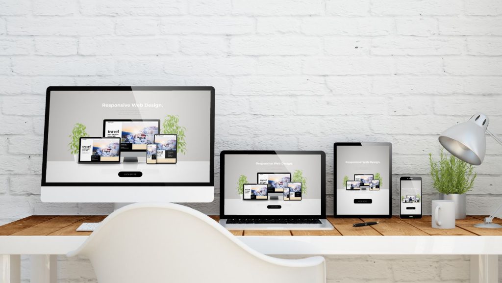
Media queries are becoming the easiest way to configure a mobile responsive website. For those that are unsure about what a responsive website is, essentially it removes the need for a secondary “mobile” website and instead you one managed website that can look nice in all screen resolutions from desktop to mobile phone. In order to do this, browsers allow us developers to use media queries to adjust a website to different screen resolutions. Below is a list of standard media queries to use on your website in order to adjust your site to the most popular mobile devices.
@media only screen and (max-width:1099px){}
This query is the first of the 3 queries. Essentially this query is for all styles that need to be adjusted under a screen resolution of 1099px. This can include widths, heights, displaying of properties, etc, but generally if it is an element that will change in both the queries below, usually the styles are applied in this query.
@media only screen and (min-width:700px) and (max-width:1099px){}
This query is for anything set for tablet size. Generally elements in here are widths being set and anything that applies to just tablets.
@media only screen and (max-width:699px){}
This query is for anything set for phone size. Generally elements in here are widths being set and anything that applies to mobile phones.


