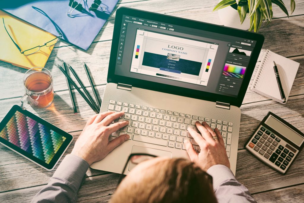
The whole process of website creation can seem a bit intangible. What gets considered? How are design decisions made? Today, we’re going remove some of the mystery and walk you through the five most important elements of graphic design that come into play whenever we create a new logo or website.
Colour Selection
Few things have such guttural and immediate power over our emotions and mood as colour. You’ve probably felt it yourself at one point, moving from room to room in a house or even transitioning from a grey indoor environment to a bright green-and-blue outdoor one. In advertising, colour is used to convey a brand’s identity and personality.
You’ve probably already noticed how the two dominating colours on our website are yellow and blue. They’re nice colours, sure, but we didn’t pick them because we just felt like it. Blue suggests trustworthiness and dependability, while yellow is used to suggest cheerfulness and warmth. Together, they tell you some of our defining factors – optimism, service, and reliability – without us ever having to say a word about it. Clever, eh?
With that said, it’s important not to let colour overwhelmingly dominate at every moment in time! Strategic use of white space or white as a design element allows the composition to breathe and gives the viewer’s eye a chance to rest and relax. In sales and retail, the thing to showcase is the service or the product. A good design will use the brand’s selected colours to make the experience of shopping memorable without being overpowering.
Smart Typography
Ah, typography. It’s the unsung hero of graphic design, frequently (if not always) responsible for both brand recognition and clear conveyance of information. It has a lot of work to do, which is why it requires so much care and consideration.
Using our own logo as an example, consider the difference in font choices between the NetGain name and this blog post. In the logo, the letters are wide, but the weight of each line is slim, and there are small, stylized tweaks to the letters, such as at the ends of each uppercase “N” and the connection between the “E” and the “T”. This is done because it’s our calling card; it should be instantly recognizable, even if you only glance at it. Coupled with our color choices, it’s distinctive and modern while remaining professional.
This blog post, by contrast, might seem relatively boring in font choice. But that’s an illusion – this font is doing exactly what we intended it to do. It doesn’t need to be ornamental or illustrative, because its function is to relay information to you as clearly and easily as possible. We’re using a sans-serif font, which is generally preferred for ease of reading in an online medium. It also compliments our brand (forward-thinking and modern) in a way that a serif font wouldn’t be able to accomplish.
Now, this isn’t to say that the only uses for typography are in a logo or a blog post. Far from it! There are endless galleries online of typography that has been combined with illustrations or colour choices to become a piece of art. It all depends on what you want it to do.
Hierarchy of Information
There are lots of pages to a website, and when we put one together, we must always consider which pieces of information are most important – to both our client and their customers. Emphasis can be given to certain bits of information, like a phone number or company motto, by placing a picture or illustration near them. Again, using our own website as an example: when you load our homepage, what’s the first thing you see?
Right under our logo, you’ll see the image of a designer, with the clear tagline, “We provide cutting edge Web Design.” That’s our main gig, so we wanted it to be clearly displayed. Underneath, we delve more in depth into our SEO and marketing skills, but website creation and maintenance were the most important things we wanted to convey to new visitors.
We do the same thing for our clients – determine which information is most important to display on each page, and then figure out a way to convey that information in a creative way that compliments the rest of the website and the client’s branding.
Balance of Elements
Every piece of a design – from a coloured background banner to a block of text – has some weight to it. The short and fast rule is that too much weight, or weight that’s not distributed in a creative way, can get the viewer bogged down and create a confusing experience.
Again, let’s refer back to our homepage. As you scroll down, you’ll notice that the information is broken up by stripes of colour – white, blue, and yellow. Each section sits nicely in the middle, creating a feeling of easy stability. How would the page feel to look at if, say, all the text was crammed onto a single, bright yellow background, with logos and icons scattered haphazardly on both sides? It’d look messy, poorly thought out, and bulky. The information you want on your website is just as important as how it is laid on your website.
Consistent Identity
No matter what page of a website you’re on, you want to feel like you’re still in the same place you landed in. The look of a website should have a unified, consistent identity on every page. When we create a website for our clients, we make sure to apply the same graphic design principles to every subsection of information. Does the logo have certain colours? Those will likely pop up as accent colours in a header or footer element. Does the layout of the front page feature circles, or horizontal bars? Those are elements that can be echoed on sequential pages, making the entire site feel unified.
It’s important not to get caught up in what’s “trendy,” either. Remember all those 3D, spinning text bars in various shades of sparkly neon from the late 90s? Good graphic design will last, and while your company image can certainly evolve over time, it should start out with a clear understanding of who it is.
Graphic design takes time and focus, but the results, especially on a website or marketing material, can be immediate and unforgettable. If you’d like to work with us on your own project, you can contact us online or call our Barrie office at 1-888-797-2455.


